Proposta per il logo contest di NANOLEVER su starbytes.it
BRIEF DEL CONTEST:
Nanolever designs and produces transducers (sensors) of force. That is, we measure very small forces up to very large forces. We can measure the weight of pharmaceutical tablets, masses, or controlling industrial processes where forces must be measured.
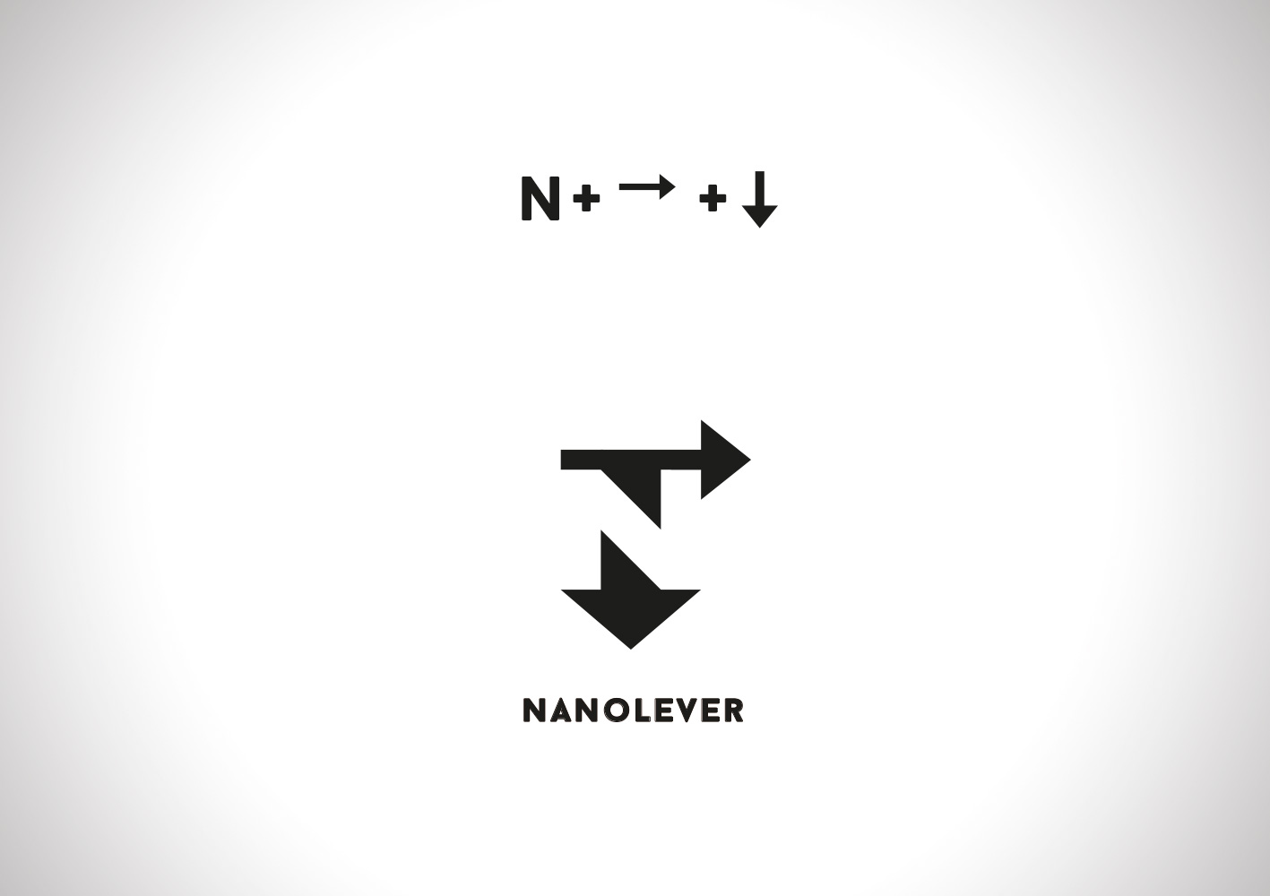
The strength in physical graphics using a vector, an arrow is drawn on to a lowercase letter.
COMMENTI DEL CREATIVO:I created a symbol combining three elements: the “N” initial of the company name, the arrow over the letter (the carrier) that is the way of representing the force in physics, and an arrow pointing down to represent the force of gravity identifying the area where the company operates. The symbol is an example of negative space, where the space which is located between objects or around the object, it helps to define the shapes and balance to the composition.
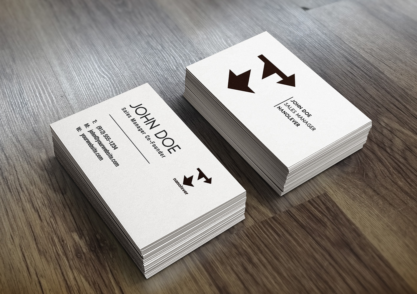
Dettagli progetto